MATRIARCH
Establishing a Brand World Inspired by Strong Women
THE SITUATION
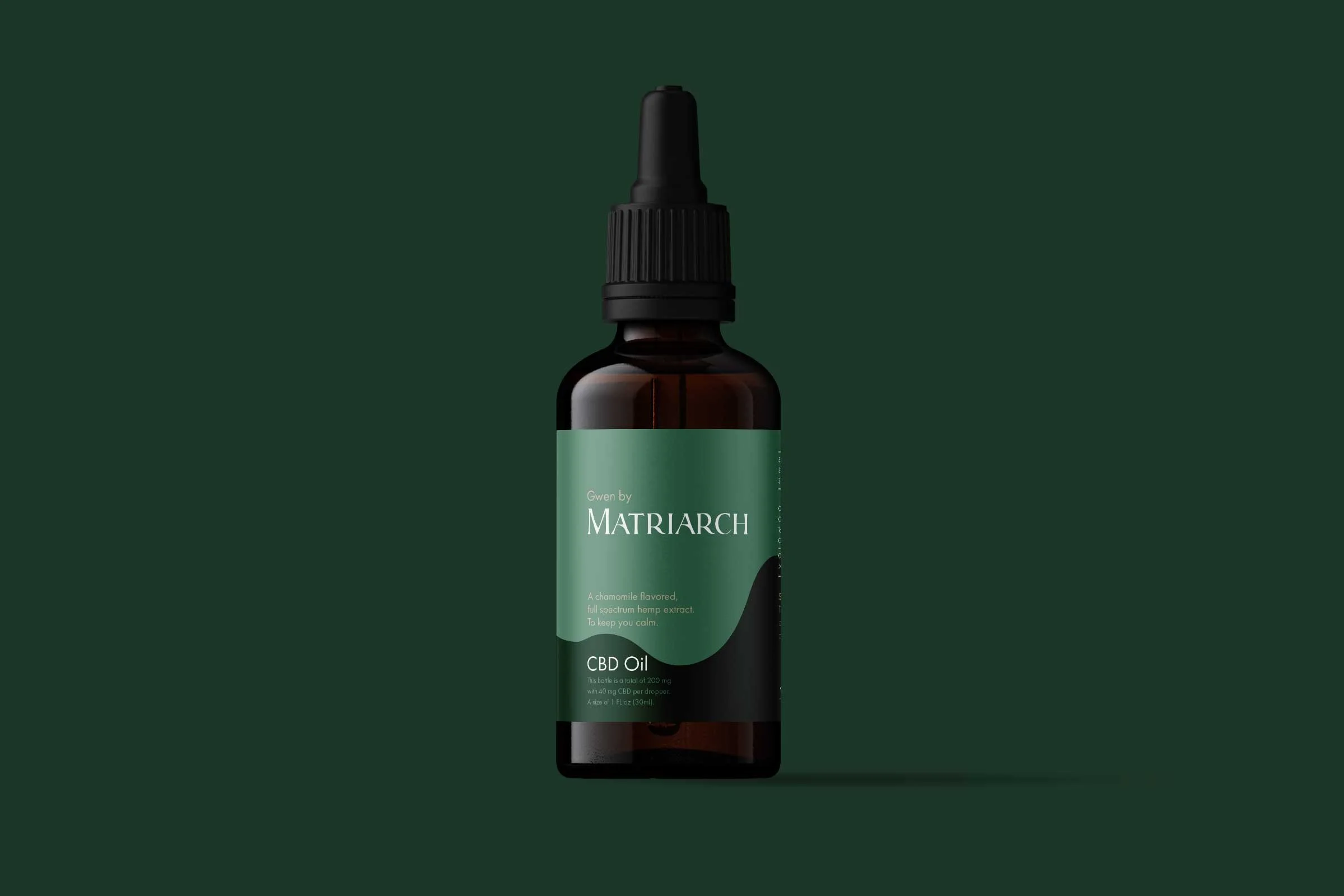
A female-owned CBD brand was looking for a brand identity that reflected their story. The two co-founders were building a brand inspired by the strong women each of the two co-founders grew up with and the farms and the hills of Vermont.
OUR ROLE
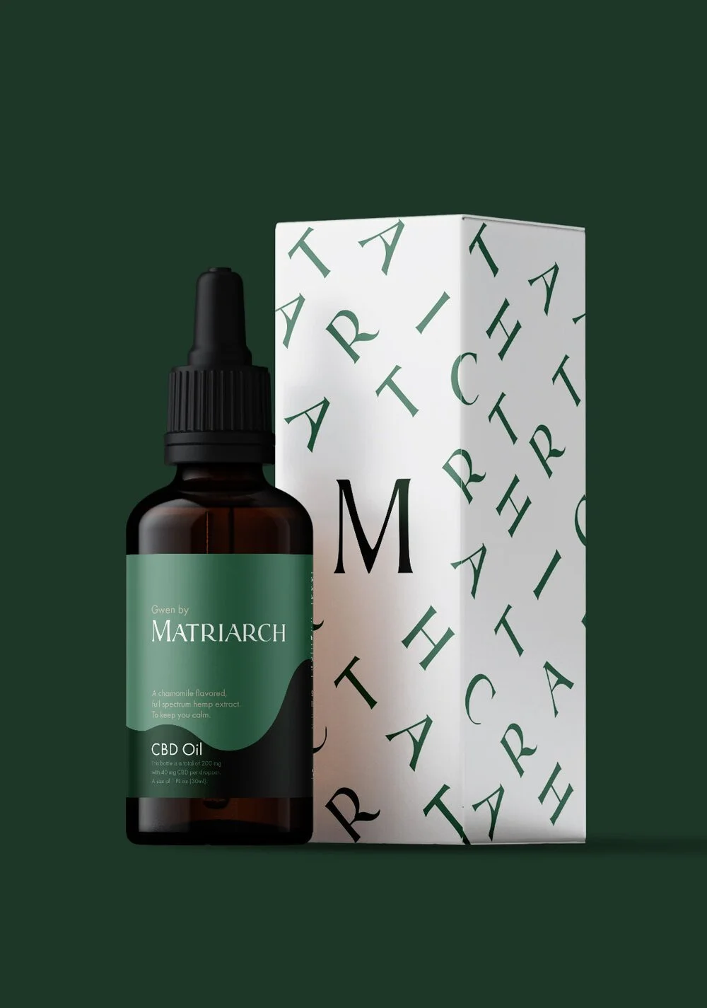
We worked with them to create an identity that would communicate their story and stand out in the crowded CBD space. Visually, we set out to evoke strength and femininity.
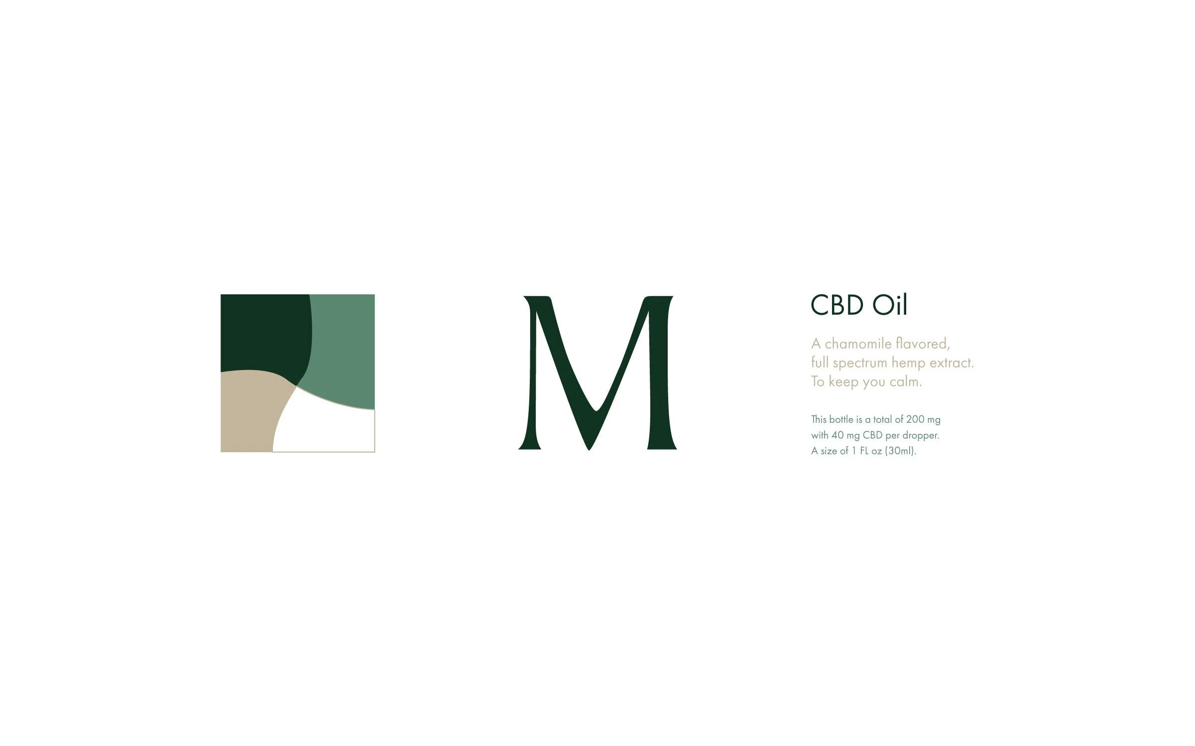
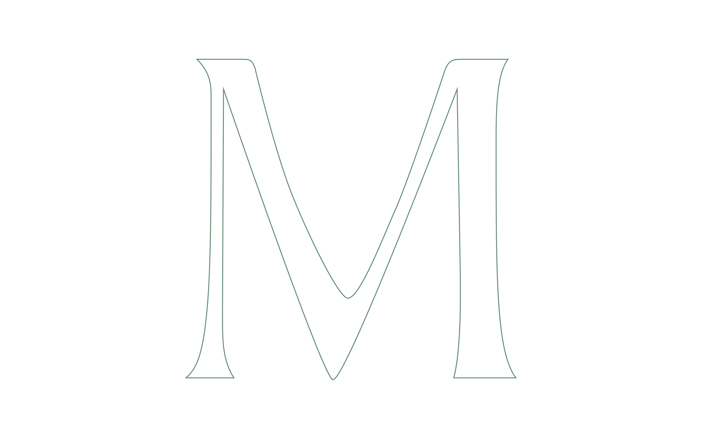
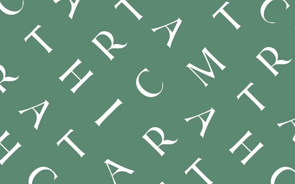

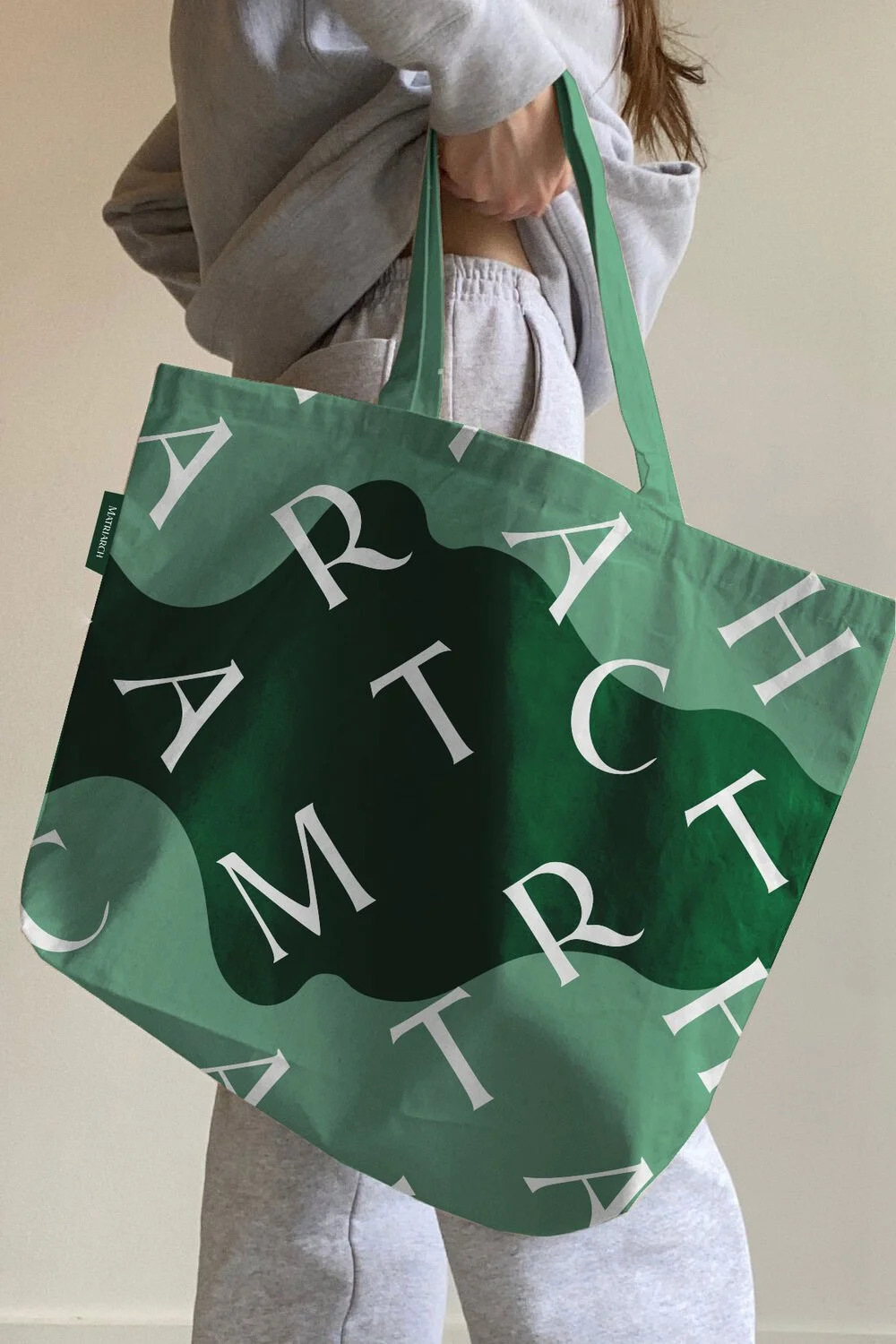
To accomplish this, we created a custom drawn logotype that tapped into organic forms and drew inspiration from the fluidity of the oil and hills where the ingredients are grown. To empower the word we decided to emphasize the “M”. We then developed an ownable pattern utilizing these unique letter forms and applied them to the extended brand world.
CLIENT:
MATRIARCH
PROJECT:
MATRIARCH IDENTITY
DISCIPLINE:
BRAND IDENTITY
VISUAL IDENTITY
PACKAGING DESIGN